

9/26
A Brand for
the Dirt World.
We celebrate and support our essential industries and the people in them.
We're Here To make the Dirt World a better place.
We are committed to making the Dirt World better by building people, leaders, and companies through tools, storytelling, and community.


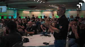
Our values are our operating system.
Our values guide how we make decisions— both while working at BuildWitt and in our everyday lives. Following these values keeps us on track to build a better Dirt World.


just humans talking to other humans.
When you write, use stories to connect with people, come alongside then, and inspire them to action. Be a guide, sharing with the Dirt World with humility and confidence.
Our brand is a direct reflection of the way we see the Dirt World and ourselves in it.



.png?width=300&name=23024_BUILDWITT_0220-2%201%20(1).png)



words have meaning. type has spirit.
Titillium Web Download ↗
Bebas Neue Download ↗
Typography is just as vital to designs and branding as visual graphics. Typographic hierarchy ensures that the most important information is displayed with the most impact so users can scan information efficiently.
Color is one of the most powerful brand tools.
The primary colors for BuildWitt are the BuildWitt orange, charcoal, and white. Shades of these colors may be used, but the BuildWitt Orange is the primiary identifier. Try to use charcoal (never black), white or gray as the background color to a design.
Our logo is
our identity.
Our mark is a symbol we hope will ultimately show up on every jobsite and will represent the positive change happening throughout the Dirt World. It's not just for our company, it's for our entire industry
 Up & to the Right
We strive for positive growth every single day
 Infrastructure
Roadways, railways, utilities, power, and mining
 Equipment Callback
Our home is in the dirt (put a dozer in it!)


USAGE
Scalability
As the logo is scaled down to smaller sizes for different placements, graphic elements should be removed from the logo for legibility.

Clear space
The BuildWitt logo should always be clearly visible. Keep the logo separated from other visual elements by a distance equal to its height. This distance is considered the minimum uninterrupted space surrounding the logo. We call it the area of isolation, or clear space, and it should be adhered to in most situations.

Usage on photography
The logo should be carefully placed on photography. Always place the logo on clear and simple backgrounds with plenty of contrast for legibility. Avoid placing the logo on busy or complex backgrounds or images to keep it as legible as possible.
 |
 |
|
Always place the logo on clear and simple backgrounds. |
Always place the logo on backgrounds with plenty of contrast for legibility. |
 |
 |
|
Never place the logo on busy or complex backgrounds. |
Never place the logo on images that don't provide enough contrast. |
Things to avoid
The double arrow logo shouldn’t be placed into container shapes, altered or embellished in any way. It should only be used in the appropriate colors from our palette. The following examples reflect only a handful of samples of what not to do.

|

|

|

|

|

|

|

|

|
Lineage
We've transformed through the years as our business has grown. When Aaron Witt shot his first photo in 2019, the brand evolution began. The following timeline illustrates its journey.

Ancillary graphics.
The spice of design.
The design elements for the BuildWitt brand are based largely off of the logo and should be used to help establish a consistent and recognizable brand externally and internally.
USAGE
Grid Lines
Just like a blueprint, the grid lines within our brand provide structure and a foundation that can be built upon. Single lines or intersecting lines can be used. The lines should be a subtle element. Usually .5px and 50% opacity is a good weight and color to use.

Tread Pattern
The tread pattern is comprised of repeating the intersection point from our logo. The pattern should be used to add texture to the design. It may be used as a background element or as an overlay on photos.

Box Callouts/Terminals
Pulled from the BuildWitt logo, the double arrow is used to create an area of focus in design. It can be used between grid lines or as the terminal point of a grid line. It can also be used to terminate points in callout boxes or frame other elements such as quotes, images, and additional graphics.

Double Arrow Watermark
Our double arrow can be scaled with a stroke applied to create a visual watermark for backgrounds or photos. Be sure to keep the line weight thin, like the grid lines this should be a subtle element. 2 - .5px at 20% opacity.

Be emotive. Be authentic. Be Intimate.
Our imagery is authentic. Photos should never seem overly staged or in front of a rolled backdrop. This imagery captures the hard-working, yet approachable spirit of our industry using real people. We are authentic, emotive, and intimate.

-2.png?width=300&name=21058_BUILDWITT_0176%20(1)-2.png)



Where everything
comes together.
When it comes to expressing our brand character, perhaps what’s more important than our elements is how they all come together. The way that each element is arranged in a given space, and careful consideration of it is essential to achieving the BuildWitt look.
APPLICATIONS
Signage & Promotional


Apparel & Merch


Digital Media


